Are you a Quiet Speculation member?
If not, now is a perfect time to join up! Our powerful tools, breaking-news analysis, and exclusive Discord channel will make sure you stay up to date and ahead of the curve.
We've seen a couple changes to card templates in Khans of Tarkir. One of them is a clear improvement, but the other is sacrificing form for function. That may not necessarily be bad (this is a complex game, after all), but it's worth noting when something has to be made uglier to work better.
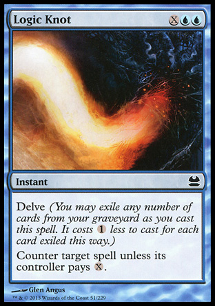
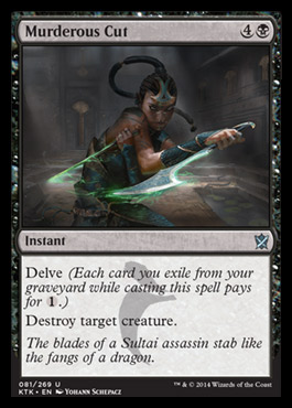
Let's start with the clear improvement. Delve's reminder text used to read like this:
It's now been shortened and simplified to this:
Cutting 13 words from the reminder text leaves lots of extra room for additional rules and flavor text, which is a total win. This also makes the rules a little more clear: using delve does not reduce a spell's converted mana cost, but instead pays for a portion of that cost. This has been the oracle text for delve for a little while, and I'm glad to see it make it onto the cards themselves.
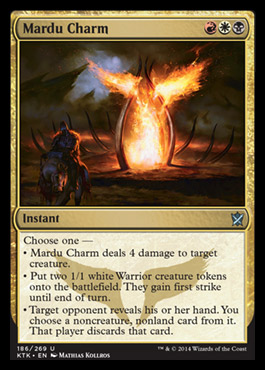
The reception to the bulleted lists on the new charms has been generally warm. The new template certainly makes the options clear and simple to understand, but at what cost? Simply put: aesthetics.
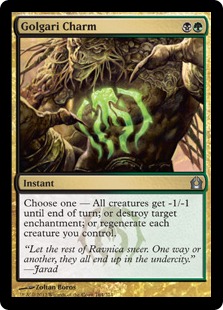
While the cards may be functionally easier to comprehend, these bulleted lists look kind of ugly. Of course, you may disagree, as aesthetics vary from person to person. Nonetheless, while I understand the reason for the change, I'm not a fan of the look. I especially hate the dash after "Choose one," but the editing team didn't have a lot of choice in that matter. Since the colon has the rules implication that it indicates an activated ability, saying, "Choose one: kill a dude, make some dudes, or strip a card," was not an available option. Still, seeing a line end in a dash like that just looks awful to me. It wasn't as eye-catching in the old template:
Like I said, sacrificing form for function is not necessarily bad. This is a sophisticated game, and anything that can be done to help new or casual players understand what's going on is a positive action by Wizards of the Coast. That said, many of us were initially drawn into the game by the look and feel of the cards themselves, and when those cards start looking like to-do lists, some of that initial excitement may be lost.
It's always a challenge to balance flavor and gameplay, and generally WOTC does an excellent job. While the changes I've discussed today are relatively small, they absolutely contribute to first impressions of players who look at these cards, both experienced and brand new. While the major changes get all the buzz, the minor changes make a big impact too—just in not in ways we always see right away. Have you noticed anything else WOTC has been doing differently with this set?


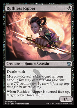


I’m a huge fan of the charm change. If anything I was expecting you to say that the new morph art is silly looking.
“That said, many of us were initially drawn into the game by the look and feel of the cards themselves, and when those cards start looking like to-do lists, some of that initial excitement may be lost.”
–
this can’t be serious? After all the lay out changes they have done in the past, this is the killer change for you?
We’re talking about only 5 cards now. How can this have a negative effect on your excitement?
It’s also clear that the bullet list allows more text without confusing too much. So more variation the the list.
That’s not really what I said. Functionally, this is a good change and will probably allow for more complex modes, but aesthetically, I think it looks worse on the card. It’s not a “killer change,” as you put it, and it doesn’t have a negative impact on my excitement—these new charms are sweet! But I think it does look worse and it probably means some cards won’t have room for flavor text that would have under the old template. The fact that WOTC does such great work means that critiques will often be regarding small matters, but small improvements still matter.
Brecht, I don’t think Danny was saying it is a killer change but it does change the ‘artful’ look of the card. If you notice of the 5 charms only the Sultai has flavor text because it only needs 4 lines. Also if you look at the Mardu charm you will see the empty space at the end of the lines which if was formatted the old way would shorten the text block. I understand the change and don’t necessarily feel either way about it but I do miss the flavor text as charms are a great way to convey the feeling of the group it was designed for.
Note that Delve, like Convoke, had a rules change that actually was functional.
So the reminder text change isn’t just aesthetic, it brings it in line with the behind-the-scenes rules change as well.