Are you a Quiet Speculation member?
If not, now is a perfect time to join up! Our powerful tools, breaking-news analysis, and exclusive Discord channel will make sure you stay up to date and ahead of the curve.
Welcome to my second article and your first step by step guide to altering Magic cards. Hopefully by now you have procured everything you need and have done a little experimenting with your paints. If you are anything like me you fiddled with it for a good half an hour before deciding it was too hard and gave up. Not to worry, that happens regularly to me and others. You did the right thing by walking away. This hobby should be fun, and you'll produce your best work when you are happy.
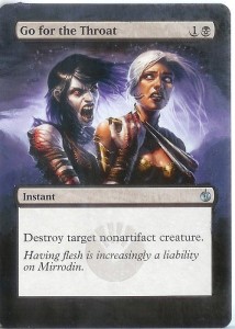
For our first project, I have chosen a great card with a surprisingly easy design. Go for the Throat should have shown up in your binder by now, and if not, they should be easy to buy for just a couple of bucks. Before we begin, I want to address an issue that will at some point pop into everyone's mind. What happens if you screw up? You have two safety nets in place here. First, mistakes can be painted over. In the event that you paint over a mistake too many times to the point that the card is noticeable thicker, a toothpick can be used to scrape paint off. Do note that this will do minimal harm to the card, but you will be able to start over again with a “clean” slate. It's at this point that I will promise not to 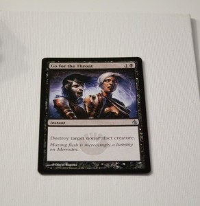 use expensive cards for these guides. I will always try to use cards that are accessible to the majority of people.
It begins...
For this project I used “Titanium White”, “Mars Black”, “Ultramarine Blue”, and “Naphthol Crimson”. These should all have come in your starter pack. I was able to do this whole project with 1 brush, and it was a “Chisel Blender” #4 size.
Mount your card using a loop of masking tape on the back so that it is secure. Since the color scheme is very dark, we will use “Mars Black” as our primer coat. Cover the frame around the picture and the rest of the borders of the card. Leave the frames around the textbox and name box. Try not to use too much paint. Our goal is not to completely blot out the background, we just want to give an even coat to put our color on. As you can see in the picture, the original color should still show through. Be sure to use nice even strokes. There is a tendency to dab and poke the paint almost like you're sketching. This will leave bumps and lines and overall unevenness in our base coat which will show through to the finished product. 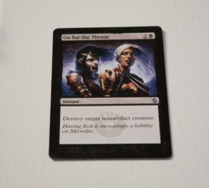 Use confident bold strokes, if you look like you know what you are doing (even if you don't), the painting will reflect this. You want this base coat to be very even and smooth.
While we are waiting for this to dry, go ahead and rinse your brush in the water cup. “Paint” the excess moisture onto your paper towel. Repeat this process until the brush no longer leaves pigment on the towel.
The First Color
For the first color treatment, we mix “Ultramarine Blue” with “Naphthol Crimson”. Use more blue than red. Then add just a touch of “Titanium White”. Work with these colors until they match the shade of purple that is showing in the background that is lower than our subject shoulders. I wish I could tell you exact measurements, but in reality, your card is from a different print run and is actually a different color than mine. This can easily be solved by painting slightly over the picture to help match the colors.
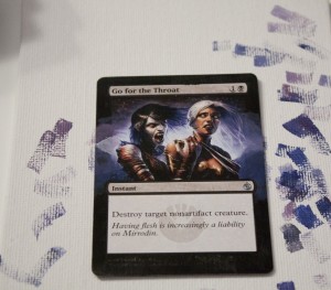
If you have used your paint sparingly, you'll notice that in the time you spent making the “perfect color”, the paint has dried a bit. Don't worry, it's water based and can be resurrected with a brush full of water from your cup.
When you do find that color, you'll find that you can now easily alter it by adding white to bring the color “up”, and by adding more blue and red to bring it “down”. By adding small amounts of either, we can recreate and match the shading effects given to us by the artist. While doing so, use your imagination to think about what is happening just outside the frame. Use the clues from the original picture to guess what shapes are occurring just outside the borders of the original picture. Take your time with this, and when it looks something like my example, you are ready for the next step.
Adding More...
The sky above the purpleish glow may appear to be black, but it is not. Mix up some purple like the first step, but instead of “Titanium White” use “Mars Black” to make it very dark. Use this above and around the Name Box, then slowly add more purple to bring the tone up to match what you have done below it.
At this point we want to return to the colors we've used in the first step (mixing more if we must) and add a touch of water to it. By thinning it with water, we allow it to spread a mix with the colors we've already applied to the card. This type of “wet blending” will give the alter a seamless look to it. Be sure to paint a little over the original artwork to help add to the illusion.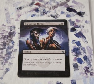
Finishing Touches
The final step is simple. Take some black and paint under and around the text box. Take care to blend the black with the color you've added to the card already. Finally, use a toothpick to gently scratch of paint that has invaded the textbox.
That's it, you've finished your borderless alter! I hope you like it, and if you don't, well nobody said you couldn't continue to work on it. For reference, this particular alter took me about an hour, but the first time I altered cards it took about 4 hours. So be patient, and once again, if you get frustrated, just walk away.
If you are happy with it, congrats! Allow it to dry for a little while before tossing it into any kind of sleeve.
Now is the part where I open myself up to comments and questions. This is the first time I've ever written a guide like this, so please let me know what I could improve upon. Also, feel free to share your newly created artwork with me by emailing me at Mbajorek02@gmail.com.
Until Next Time!
The Painter's Servant




Once the paint dries, and it's in a sleeve, can it be shuffled okay? Or do you just have a pretty card?
Though I never play with them myself, I've painted cards for a number of people in my play groups. They all see play in various EDH decks and show no signs of wear. If you are worried about it, it's not uncommon to put a spray finish on it.
Great stuff! Very clear and concise. Can you do a tutorial on how to do a “scorched fire” effect? e.g. Flameborn Hellion?
Beautiful alter. I'm way to terrified to ever try it myself, but I love seeing these online.
Great article, but why is this a "Finance, Insider" article?
http://www.mananation.com/altered-reality-dark-confidant/
Heres another neat alter to check out, just posted today, too.
Proph: I have next weeks article set, but look for a fire effect soon.
Chosler:Practicing on a basic land is a great confidence booster.
Adamzak: I will be covering more of the financial benefits of this process in detail beginning with my next article. Either way, I'm not sure their is a proper category for this type of article…
Zrbrt: You like mine better right?? 🙂
Financial + Altering? I just smiled in joy.
As a rule, I usually value a card around 50% more if it's altered; that's what I do at my local FNM.