Are you a Quiet Speculation member?
If not, now is a perfect time to join up! Our powerful tools, breaking-news analysis, and exclusive Discord channel will make sure you stay up to date and ahead of the curve.
This week's article will be a break from the practical applications of painting. Instead we will discuss some of the color theory that goes into matching colors and ultimately creating better alters. It would be easy to blow this article off as filler, but any artist of any kind needs to know the theory of color. Understanding the theory behind what we see is the biggest step towards not needing a guide to paint cards. So, we begin!
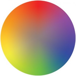
To understand anything about color, we must familiarize ourselves with the color wheel. We all remember this from high school art class, but it is easy to lose touch with just how fundamentally important this tool is. The color wheel shows us the three primary colors or hues (Red, Blue, Yellow), and in turn three secondary hues (Purple, Green, Orange) make up the basis of its' existence. All of the other colors exist as a mixture of any of these six colors. In addition we find that adding white or black to any color will change it's' value, thus creating a different version of that color.
On the more practical side, we can use the color wheel to help us find exactly which colors we need to mix to achieve a certain hue or value. More to the point, this tool is free from the effects of light and shadow, and therefore gives us a more accurate reading of color than looking at the picture we are trying to match.
It's all an illusion...
Color is a very tricky subject. There are certain illusions that are created by light, shadow, and even adjacent colors. Take a look at 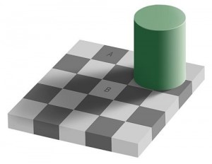 the checkerboard. Our brains will apply logic to this picture and tell us that “A” cannot possibly be the same color as “B” because one is a black square and one is a white square. The reality of the situation is that both squares are the same shade of gray. Square “B” looks lighter than “A” because of the light and shadow of the squares around it. This is an example of the Color Constancy Illusion, and people far more learned than myself study it (So if you don't believe me, Google it). You can see examples of this anywhere there is shadow. Take a look at the surface of your desk, and note the color. Then create a shadow over a part of the desk, our brain tells us that the desk is brown (or whatever color yours is) even though we are looking at a completely different value of brown where the shadow hits. If we are to re-create this image we must use two different values of brown to do so. When the image becomes more complex, our brain still strives to maintain its' opinion of the color we see, and illusions like the ones shown here are the result. Once we have grasped this concept, we understand that logic plays almost no role in color theory.
Furthermore, as shown in the color cubes, we see that it is not only light that can change our perception of color, but the hues and values around that color as well. This model also introduces us to the term “complimentary color”. Despite their name, complimentary colors are pairs of colors that are opposite each other on the color wheel. Notice that a dominance of one complimentary color can mute 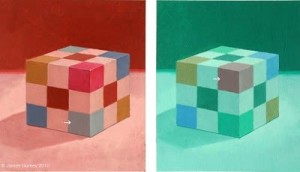 the appearance of the other.
Putting it all together
Now that we have a basic understanding of the theory, we can look at it in action. Look at the picture of the Aether Vial. The trees that grow behind the woman appear brown, but as I painted it, I realized that I needed a value so light, that it was almost tan on my palette. It appears brown due to its' proximity to the very light background. Similarly, the green highlights on the tree are actually a dark shade of Hunter Green that appear light due to the apparent darkness of the wood. This card shows a dark color made to appear light by a light color made to appear dark. Does your brain hurt yet? Mine does.
We established earlier that logic plays a very small role in color. What then do we use to replace logic? We must turn to our 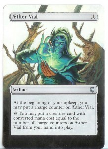 imaginations. Allowing yourself to believe that these examples are possible (which they are) is the first step to being able to create these illusions yourself. Utilizing this information in practice will help you train your eye to recognize exact colors sooner. This will help you save yourself a lot of paint and frustration, and more importantly time as you continue with your painting.
Before I sign off, there is a question that I get asked rather often that I would like to take some time to answer. The question is:
“Which cards net you the most value when you alter them?”
This is an interesting question. I always have the best success with EDH generals, or Commanders as they are now being called. Flashy generals are always popular, as evidenced by the rise in value of foil legendary creatures.
My success with standard and legacy cards has been rather limited. This is due, I'm sure, to the fact that some judges will deem these cards “marked” and therefore illegal to use in tournaments. To clarify, this is the ruling set forth from the rulebook itself:
Section 3.3 Authorized Cards:
Artistic modifications are acceptable, provided that the modifications do not make
the card unrecognizable or contain substantial strategic advice.
The Head Judge is the final authority on acceptable cards for a tournament.
Thanks for reading and don't forget to leave some feedback for me, you know I love the attention.
-The Painters Servant
Twitter: PaintersServant
Email: Mbajorek02@gmail.com
The checker board illusion was taken from www.forgetomori.com
The Color cube illusion was taken from gurneyjourney.blogspot.com




The ruling you're using there is not the reason they're disallowing heavy alters. Alters that go to the edges of the card frequently result in the card being marked, which falls under a completely different rule.
I love this continuing series. I'm still way too clumsy to attempt it myself, but this is offering a ton of value for readers. Keep up the good work!
Great information. With each article, you get me one step closer to pulling out my miniatures paints from deep with the chest o' gaming.
A small request, if I may: when you do future guides and walkthroughs, could you point out the color "fallacies" like you did when describing the colors in Aehter Vial? For example, before, when you would have written, "Use Angry Fuchsia to extend the tentacles", instead write, "While the tentacles may look Angry Fuchsia because of the surrounding shadows, they are actually Gentle Vermilion."
Hmm, now that I wrote it out, I guess it's a larger request than I thought. Still, I do think that would be helpful. Either way, keep up the great work!
@josh: Excellent point, but I think the important point within this sepcific ruling is that the Head Judge is the final authority, no matter which ruling he/she decides to enforce.
@Corbin: Thank you, never underestimate how much value there is in a comment like this.
@Womby: I'll take a look at doing something like that.