Are you a Quiet Speculation member?
If not, now is a perfect time to join up! Our powerful tools, breaking-news analysis, and exclusive Discord channel will make sure you stay up to date and ahead of the curve.
Given the all the talk about legacy prices, I thought I would add my two cents. My opinion is that I have no opinion. The prices are going to do what they do, no matter whose “fault” it is. All I know is that I listened to John Medina and the fine writers here at QS and got in while the getting was good. As such I have my play sets of Force of Will and Wastelands and I don’t need to worry about their prices. I'm not an economist, so I don’t know about bubbles and how to break them, but I do know that the warning signs were there, and I heeded them. As readers of this site I know you did as well. If you didn’t, there are still interesting ways to help ease the cost of getting into legacy. Naturally, I'll be talking about altering legacy cards to do just that.
Lotus Petal is still an easy to pick up legacy staple. Earlier I stated that I'm not an economist, and so I don’t have a reason for this, but they are hanging around $4. These never stay in a binder for long either. Perhaps their best feature (for us) is the artwork. It's a very evocative picture, one that is fantastic in the literal sense of the word. Pictures like this allow us the inspiration to do more than just expand the borders of the artwork. With the fast pace that legacy cards are being scooped up, there is a huge demand for unique cards, be they foreign, foil, or altered. In other words, the legacy demand drives our prices up. The plan here is to take a $4 card and turn it into a $25 card, perhaps a Grim Monolith or a Mutavault.
 I must also mention that I am introducing a new color to the arsenal today. The color is Brilliant Purple and can likely be purchased from wherever you got your other paints. From time to time, I will introduce certain new colors. While I realize that new colors do cost money, they also save a lot of time and aggravation, and far exceed their costs in other benefits.
To begin with we start with an undercoating of a mixture between Naphthol Red and Ultramarine Blue. The general balance of the colors doesn’t matter as we just want to cover the original markings on the card, but a deep purple is desirable. The next step is tricky, but the result can be quite beautiful if done properly. The background of this card is layered, and so to match it, we must do some layering of our own. The first layer is the primer that we just laid down. For the second layer, we'll use a very dark gray mixture of Mars Black and a touch of Titanium White. The gray should be brushed on in and around the darker parts of the background. I chose to do mine almost in stripes radiating from the petal, but you may choose to do it in a different pattern. This is your chance to use your creativity to create something unique. Just be sure to pick out the name and casting cost so as not to lose them.
The third step is something that I like to call “wet brushing”. The technique is similar to dry brushing, but it is done with a wet brush, usually dipped in water. There is a fine balance between how much water is too much and not enough, this can only be found through experience. Optimally, the paint should go on wet but not run. Too much water may 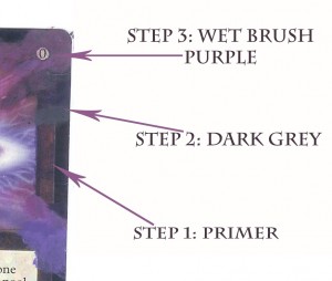 result in the removal of paint from the card, so err on the side of caution. The color is a mix of Naphthol Red, Ultramarine Blue, and our new friend Brilliant Purple. Mix the red and blue first, then adjust the tone with the purple. With your wet brush, pick up some paint, and wipe some of it off on your palette. Apply the paint over the gray and primed areas alike. You'll notice that the moisture gives the paint a bit more opacity, which allows it to appear darker over the dark gray. Now, adjust your purple mixture with red, blue, purple, or even white and continue this operation, matching the colors closely (Not exactly) around the borders of the card. You can see that the water allows the colors to blend in interesting ways. Don’t worry about the sparkling blue bits flying off of the flower, remember that we always paint the background first, then move forward in the picture.
 This may take some time, but you'll soon find that there are only two or three mixtures of purple and pink needed here, and that they will blend to create their own subset of colors. While you're at it, why don't you fill in the bottom of the card with black, and blend that in too.
Having familiarized yourself with the color range of this project, it should not be difficult to mix up that sparkly blue color from around the petal. Allow yourself a second to imagine what and where these little magic lines are traveling to and from and what they should look like while doing it. Visualize it, then paint it. You may need to use just the tip of your brush to create the thin lines that you want. Don’t forget that spout from the bottom, which turns out to be nothing but a small set of vertical lines in different colors. When you have finished with that, you should 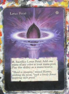 have a very satisfactory borderless Lotus Petal, and this would be a fair place to end the project. You are of course welcome to stop here if you like, but this card gives us so much more to work with that I won't allow myself to stop here. I will say that the “Step-by-Step” portion of the article is done. So consider the following the “advanced” portion
You'll notice that this petal appears to be shooting up from some sort of spout or well. So imagine how that might look and “draw” the outline with your brush to create a primer coat. I used a very light purple for mine.
Brace yourselves, because I'm going to turn you loose in a second. Before I do, it is important to note that while I can teach you brush techniques and color theory, ultimately your success will come from your creativity and imagination. Fortunately, we are painting a world where there are no limits, no right or wrong way to do things, and no rules on how to do them. When going above and beyond a borderless alter, you must use your imagination to create something from the clues that are given to you from the artwork.
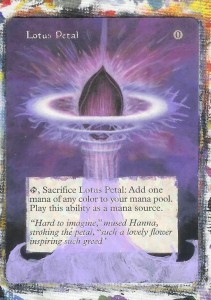 You can see from my example, that I started with a darker purple, and worked my way up to a very light lavender color. I used pure white to create highlights. I used very broad, free, confident brush strokes, and generally had the most enjoyable five to ten minutes of my painting career. I can also tell you that I used the same color mixture as the back ground, adding Brilliant Purple and Titanium White in turn to make the color lighter.
Take a minute now to visualize your picture. How do you imagine yours? Are their more cascades? Perhaps it creates a mist along the bottom. Does it end in a more rounded curl instead of the points that I have created? Your spout should be your own, but certainly feel free to mimic what I have done here if you happen to like it.
I hope you all are working hard on your contest entries. There are only 2 weeks left before the due date. Again feel 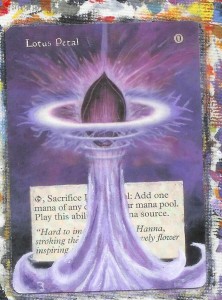 free to contact me with an questions.
-The Painters Servant
Twitter: PaintersServant
Email: Mbajorek02@gmail.com




I can't paint at all, but I do love looking at altered cards, so this series is awesome!
Have you considered using frisket or another liquid masking? It makes for really clean lines!