Are you a Quiet Speculation member?
If not, now is a perfect time to join up! Our powerful tools, breaking-news analysis, and exclusive Discord channel will make sure you stay up to date and ahead of the curve.
Note: You may notice I am a bit more brief in my description of color and technique in this article. For more advanced readers I hope this will be an improvement. For those of you just beginning in this hobby, or in the reading of this series, please feel free to peruse some of my earlier works to catch you up to speed.
When running a business, it is important to offer as many services as you can. For a lawn service, you may offer to cut, trim, edge, and maybe even thatch their lawn. This gives you the edge over the business who will only cut and edge the grass. In a business of card alters, we can do the same thing. Although border-less alters are the most common, they are by no means the only alters we should provide, and by extension advertise. With a little thought and imagination, the possibilities are limitless. Today, we go wide screen.
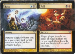
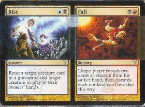
Once again, we are pinning our hopes to the rise of Commander. Some of the most useful cards tend to be the split cards, as they offer two cards in one. These cards also offer interesting possibilities as there is more than one composition to work with. Today, we will work with Rise/Fall and attempt to blend the two pictures together. What we want to do is extend the art over the border in a straight line to create a panoramic view of the art. This type of alter, while rare, can be striking.
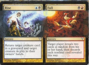
The base coat should be a dark blue (Ultramarine Blue mixed with Mars Black) on the Rise side, and a Dark Red (Naphthol Red and Mars Black) on the Fall side. I chose a thin coating of Mars Black for the middle, as I wasn't sure what I wanted to do there. Often times I find that I have a basic idea of what I want to do with a card and flesh it out as I work. When this is the case, I try to be as conservative with color in those areas as I can. The more paint I put on, the thicker the card gets. Notice that I used Titanium White in the upper middle, knowing that I would want a lighter color in that area.
Examining the original art closely shows us the details of the card. Until I had begun painting this card I had never noticed the background on Fall was composed of skulls. I find that as I paint cards, I also gain a deeper appreciation of the art, and the artists. To paint this area, simply finish the patterns of the skulls by using a lighter version of the base coat. I used Cadmium Yellow to bring the tone up for this. I also used this color in the center area, having arbitrarily decided that I wanted the Rise art to be on top of the Fall art. I mixed yellow and white to create the yellow of the light source in the top left corner.
The Rise side was a little tricky. I found a proper background color by adding Titanium White to my base coat mixture, which resulted in a slate blue. After a bit of experimenting to match the lighter blue I then abandoned the use of Mars Black, and just mixed the white and blue for the gaseous death that is fuming over the borders. I carried this light blue over into the center where it met with the light yellow from the other painting. Once again, I tried to avoid painting near the rocks of the tomb. I wasn't quite sure what I wanted to do with that, but the time to decide was coming quickly.
Having the outer borders satisfactorily done, I turned my detail work to the center. I decdied the best way to work the two light sources together was a sort of swirl. I dragged the light blue down under the yellow and into the Fall composition. I did the opposite with the yellow to create a sort of Yin and Yang design. I used a bit of white to blend them together. I didn't want to mix the two colors, as green isn't a part of the color palette in either of the pictures. For the tomb I simply extended the rocks over the center using varying mixtures of black and white. I used a dry brush technique to create some texture for the stone.
I was surprised at how quickly this particular card was finished. I suspect that my running out of yellow was a factor, I would have liked to touch up the right side a bit more. This leads me to an interesting bit of advice. When you first sit down to start or continue a project, remember to lay out everything that you will need. This will keep you from having to rush around looking for a particular color while your mixture dries, or from being surprised at running out of a certain color.
 I also wanted to share a bit of good news, and a bit of bad news with you. The bad news is that I haven’t received a single submission for the art contest. While I can only assume that most of you, like me, were consumed by final exams and the like; I am pleased to say that this has led me to the good news. I get to keep my foil Mirran Crusader, and the extra boosters I had purchased for prizes contained a Tezzeret. Contest or no, I want to stress the importance of continued practice in this craft. Only by trying your skills will you learn to perfect them.
-The Painters' Servant
Twitter: PaintersServant
Email: Mbajorek02@gmail.com


As usual, good writeup, and the final art is really cool. I would love to see this card with the art extended all the way up the top and bottom, if you're looking for something to do for next week. Once I finish building my EDH deck, my next step is definitely getting some alters.
Damn! I'd forgotten about the art contest. I'm really keen to try my hand at doing some alters… unfortunately due to the earthquake we had in February I've only just managed to get access to large amounts of my stuff!
Corbin: I'm planning on doing a full art alter sometime in the next couple of weeks. Feel free to consider me when getting your alters done
Paul: Feel free to send in your artwork, I'll give it it's due in a future article. I always love to see where my "students" are at!