Are you a Quiet Speculation member?
If not, now is a perfect time to join up! Our powerful tools, breaking-news analysis, and exclusive Discord channel will make sure you stay up to date and ahead of the curve.
The New, Old, Borrowed Blue Box
 Welcome back again to the Painter's Studio. Today we finish our project from last week and discuss some of the things we learned from it. As you remember we had finished the background of our spacy-wacey new alter and now have to paint the subject of the picture. You should all know what a TARDIS is by now, because you took my advice and watched a little Doctor Who this past week. Those stubborn few who haven’t can take this time to Google “TARDIS” and get the general idea. Do be careful not to get carried off by links to Karen Gillan pictures though, you may never come back!
Stop daydreaming about redheads...
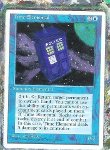
So, to begin we need a base coat of blue so lay one down with your Ultramarine Blue. The windows will be yellow, so be sure to leave those alone as yellow does not cover well. My first coat looks like garbage, but it served its purpose of helping to cover that unsightly sketch of mine. After you have finished with your base coat, feel free to fill in the windows with a mixture of Cadmium Yellow and Titanium White. You wouldn’t know it from my picture, but the white helps the yellow cover the sketch lines.
Next we add another layer of Ultramarine blue to the TARDIS. The layer looks by far better than the last but we seem to lose all depth perception with it. To fix this we must add shadow to the box, and to do that we must consider our light source. The planet in the background is a decent source of light, but that would throw the front of our subject into shadow, so I have decided (at least for my own picture) that a more prominent light source lays outside the borders of my picture and shines directly on the front of the TARDIS. This would put the visible side of the TARDIS into shadow. By adding a very small amount of black to Ultramarine Blue we achieve the desired color, after that it's just paint by number.
Details, Details...
The details always prove to be the hardest part, and this proves doubly so when recreating a cultural icon. People already have an expectation of what a TARDIS should look like, and are often disappointed when a painting does not meet that expectation, though most are willing to forgive any inaccuracies due to the small size of the project. Either way, me must try our best to come as close as we can to the real thing. I used black to paint in the square indents in the paneling. With a flat brush and a very small amount of ink, I touched the very tip of the brush to the spot to create a very thin line, and continued this to create the squares. I used this technique with blue to create the bars on the windows, and with white to draw and fill in the white panel. I also used it to help define the  beveling on the top of the TARDIS.
I used a small lining brush to do the words, though you may use the corner of a flat brush to the same effect. After that I just tossed on the antenna and called it a day.
Hating Yellow and Eating Crow...
I'd like a take a moment and share a few lessons that I was reminded of while doing this project.
The first is a simple one. Some colors cover better than other colors. Yellow and orange in particular will take many more coats than anything on the blue side of the color wheel. This is important to keep in mind when painting fire. The second is a lesson in humility. Every so often as a painter I become so confident that I honestly believe I can paint anything. This is a brilliant thing because it allows me the courage to try more challenging alters. Every so often though, I run into something that is a little beyond my capabilities. This TARDIS certainly gets the job done, but it is by no means something that I would proudly display. When you are forced to eat a little crow, it is important to learn from the incident and move on. Remember that the reasons you have failed are not reasons to give up, but only a reminder that there is always more to learn and practice.
You may have noticed that I have been making an attempt to keep my articles shorter. This is because I have found that when I read articles online, I tend to read shorter articles more thoroughly and skim the longer ones. So I put the question to you: Would you prefer a longer article each week?
-The Painters Servant
Twitter: PaintersServant
Email: Mbajorek02@gmail.com


