Are you a Quiet Speculation member?
If not, now is a perfect time to join up! Our powerful tools, breaking-news analysis, and exclusive Discord channel will make sure you stay up to date and ahead of the curve.
Last week, I was fortunate to receive a review copy of Duel of the Planeswalkers from the generous folks at Wizards of the Coast! I thought it only fitting to give the game a full review here on QS as a way of thanking them, and helping them publicize this excellent game. I have mixed feelings about the game due to some specific shortcomings, but my overall opinion of the game is a positive one, and I find myself going back for more after I play every game.
Installation
Things got off to a rocky start, as I had to install Steam, which I just dislike. I don't want to have to install secondary software in order to play a game I purchase. This may seem like a little annoyance, but it's most often a flood of tiny annoyances that render a game uninteresting. I sincerely hoped that this would not be the case! Once Steam was installed, the game wouldn't start. Lovely. I played around for a while and finally found the configuration file where I had to manually change the game's resolution so it would run on my screen. Modern games should not require editing a .ini file, or anything similar. I was already very frustrated, but I would discover later that my frustrations would be overshadowed by pure delight and enjoyment.
UI
Upon loading the game up, I was immediately impressed by the visual stylings of the User Interface. Everything is gorgeous and well-designed, but some of the menu systems make no sense. I get that the Apple-style "coverflow" design is all the rage right now, but there's no reason to make the game's main menu emulate it. It shouldn't take 5 mouse clicks to get to the Exit button from the main menu. Most of my issues with the game are related to the "workflow" and UI, which would be very easy to fix in an updated version. Its fundamentals are very, very good.
Graphics
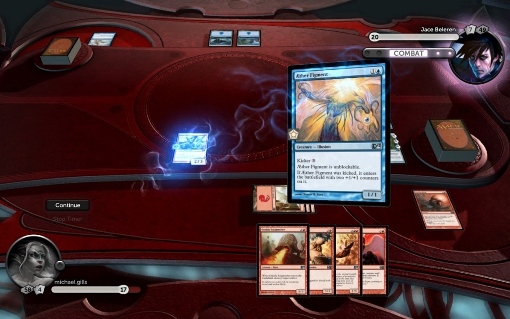
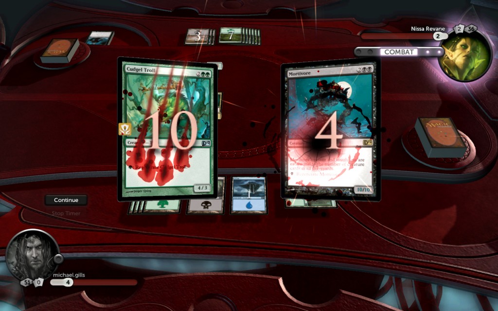
The pretty graphics got annoying very quickly. The swirly summoning sickness graphic was very helpful, as are the hovering flying creatures, but the random other swirly and sparkly graphics were really quite unnecessary, and lagged my system noticibly. For those with a dedicated graphics card, this will be no issue, but my system is an all-in-one tablet PC with a cheap, integrated chip. This could be solved by simply giving the user an option to turn down the animations. Oddly enough, it seems to not have Tablet PC support, so I can't play with the touch-screen. This is hardly an issue, but it bears mentioning.
Gameplay
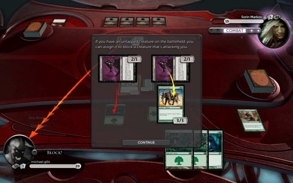
Bearing in mind that I'm a veteran Magic player, and this game is meant for beginner to intermediate players, some of my gripes with the game won't apply to its target audience. For this site's readers these are relevant concerns, but they don't detract from the overall enjoyment of the game too badly. A few of these caused some oddities while I was learning to play, such as not giving me a window to tap an attacker in the beginning of combat step, but intelligent playing and the right options configurations can mostly fix that. (Hint: If you're reading this site, you should probably set everything to "advanced" or "expert".)
The AI makes some blunders even on the highest difficulty, but I understand the technical challenges of writing an AI to play Magic. In general, the AI does a good job of putting up a fight, but expert players might have a more fun time using it to play online instead. Another thing that experienced players might find annoying: all the animations when cards change zones and such. It adds a lot of time to the gameplay, but it can also be very helpful. Again, an option to toggle all animations would be fantastic, but it's not a big deal.
Now that I've got all my little gripes out of the way, it's time to sing the praises of this freakin' awesome game. The aforementioned items are the little things you will notice and think "That's dumb, why can't they just fix that?" but the gameplay makes up for these shortcomings. First of all, the campaign mode and achievement system is absurdly additive. Everyone loves games with achievements, and DOTP handles this very well. Unlocking cards is great, and it lets you develop a deck while the game gets more difficult. The one change here I'd like to see? Stop adding my unlocked cards to my main deck! I keep starting my next game with 61 cards! Just add it to my sideboard, or even better, just give me a "deck editor" button on the "You Unlocked A Card!" screen. Having to return to the main menu just wastes time. I want to keep playing, not muck around in the menus.
The decks are very well balanced. None feel too powerful, and they are all great fun to play. I've never been so excited to see a Glory Seeker in my life. DOTP feels like old-school Magic; you are almost playing for Ante with the card unlocking system, and the decks feel like 60-card Limited. This makes the game a great low-commitment way to get your Magic fix. Drafting on Magic Online takes hours, and getting people together to play is often like herding cats: chaotic, unreliable, and damn near impossible. You can sling a single game on DOTP on your lunch break if you want!
Decks
The decks are also well-tuned against each other. I was getting myself killed against the Merfolk Planeswalker, Kiora Atua, over and over again because the White Puresteel Paladin deck can't actually beat double Simic Sky Swallower. Nice deck, Kiora. Ironically, "Kia Ora" means "Be well and healthy" in the language of the New Zealand-native Maori people. Don't ask why I know this
Anyway, I tried to beat her with the White deck a few times, and eventually switched over to the Red deck. I immediately beat her with Grim Lavamancers and Earth Elementals. This really showcases the importance of match ups and metagaming to new players, since the lesson is taught harshly. Sometimes, you're just a dog in that match, kid, and you only learn that the hard way. This also adds a load of flavor to the game, since you're ostensibly emulating a Planeswalker. It's up to you to choose the right tools for your battle!
Challenges
Another beginner's tool, which I believe every Magic player should try, are the Challenges. These are fabricated game states that are designed to teach a special lesson. For example, one can show you how to block effectively with a creature that has "Protection from Green", a lesson you'd be wise to put to use in the next campaign battle. The challenges are specifically designed to introduce new concepts to new players, but even old dogs like me will appreciate brushing up on fundamentals.
By breaking down specific game concepts into modular challenges, the game helps players form some mental shortcuts that are so crucial to success as a Magic player. The game doesn't overwhelm the player with new concepts either; they are slowly introduced at a pace that a new player will appreciate. A more advanced version of the challenges would be something worth paying for, even if it was only a buck for a 10-pack. These puzzles would be an excellent tool for intermediate and advanced players as well.
Despite all the minor annoyances, DOTP 12 is an exceptionally well-thought-through game that is still slightly rough around the edges. With minor modifications to the UI and to the options system, many of these little annoyances would disappear and we'd be left with a true gem. This game is responsible for a large influx of players into the paper version, since it is the best teacher I've ever met. Seriously, no human could match the structure provided, and it provides a perfect pace on the learning curve. Finally, online play lets the user grow out of the game while still enjoying it for what it truly is: a convenient way to play some casual Magic without a large commitment of time or money. I applaud WotC for producing a great project, and I only have one thing to say: give me a graphically simple version for my iPad already.
Seriously.





Hi, the game was published more than one month ago
This review is a fail also because you could take the chance to make a financial analysis of the three special edition foil titans that comes with every version of the game. You didn't even write that there's a code to withdraw a bonus card from a specialized store.
@Roberto I think perhaps you're misunderstanding the intent. This read like a professional game review, and I enjoyed it.
Even though it was published some time ago, it's still nice to see. I don't think the financial analysis of the titans are that big of a deal either – I think the vast majority of players are going to go with the system that they prefer to play it on.
Overall, nice article.
Did you happen to play the first DotP? D12 is definitely the better tool to to teach magic, but there are some very odd choices in it. Compared to DotP the life total is a tiny little number in the corner, which I found a bit weird. Also, it is never clear whether you're in declare attacks, declare blocks or combat damage and there's still no end step. The online matchmaking thing is also a bit weird in that if I want to play 1v1 I have to select free-for-all and just try to start the game before a third player shows up.
Overall I think it's a great game, but there are definitely some oddities in there.
Great review, but nothing on the new Archenemy part. I'm still disappointed you can play as one.
I was given a review code last week, and only got around to playing it for a little while. I wrote this review as an courtesy to WOTC for giving me the chance to try it out. Everyone already knows about the Titans anyway.
There was no reason to discuss anything financial here. I haven’t had a chance to try every last feature, but so far I really dig what’s going on. This is the first DOTP i have played, for reference.