Are you a Quiet Speculation member?
If not, now is a perfect time to join up! Our powerful tools, breaking-news analysis, and exclusive Discord channel will make sure you stay up to date and ahead of the curve.
You might have noticed a few changes around here lately. And by lately, I mean about 10 minutes ago. You might also have noticed that there hadn't been many changes around here lately; I'll be the first to admit that our old theme looked a bit dated, and it was long overdue for a face lift.
Before I get into the bits and pieces of what we did (beyond, you know, modernizing everything), let me show you where we came from. This is what QS looked like circa July 2009, a about 6 weeks after its unceremonious launch as a one-man blog.
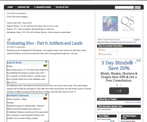
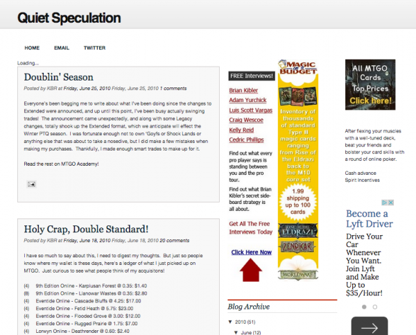
...and 2010. You can see we've evolved...a bit.
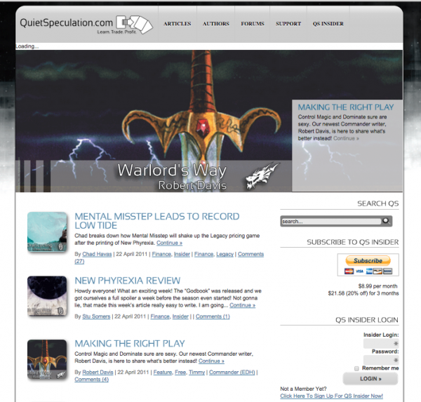
In 2011, we took things to the next level, as you can see below. We got some professional UI help, installed software to let us take on subscribers, and started to take this whole "mtg finance" thing seriously.
2012 brought another evolution to the home page.
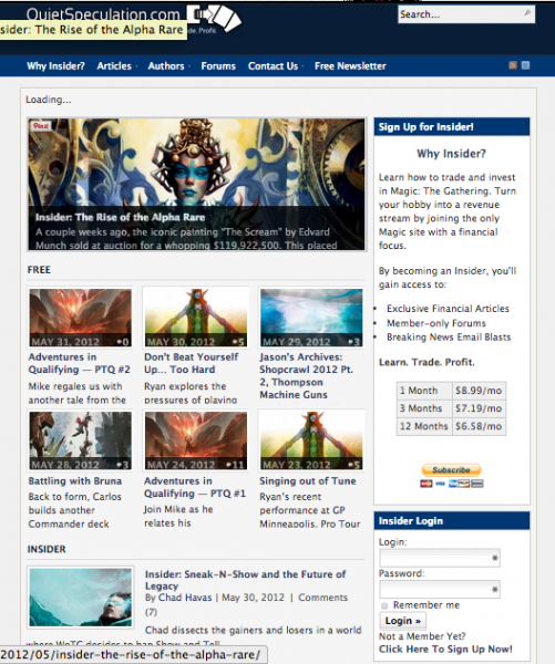
Logging in just a few months later, however, you'd see something that's starting to look familiar.
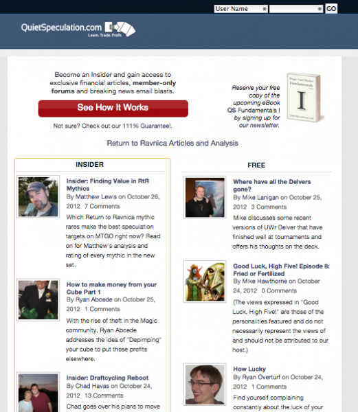
At the end of 2012, we debuted Trader Tools for the first time. If you ever needed a dictionary definition of "Butt Ugly", here you go. It worked, and it did its job admirably, but it was a far cry from what it needed to be.
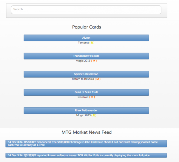
The next version of Trader Tools, v2, looked much like the v3 version you were using until about 9am this morning. We were proud of v2 when it launched (and v3, which was largely a back-end update); it was our first attempt to use responsive design, Bootstrap, jQuery and many other modern web technologies. For its time, and considering the expertise of the builders (e.g. Tyler and I), it was damned good. For its time. And its time has finally passed.
Today, we're proud to unveil the 2015 QS Theme. We've put many hundreds of man-hours into it, at the expense of many pounds of coffee and tea. There have been late nights, early mornings, and lots of friendly disagreements on HipChat. (Tyler Tyssedal, our front-end dev and managing editor, has strong opinions, which is good because he's almost always right).
There are too many changes, upgrades, improvements and tweaks to list here, right now. Over the coming weeks, we'll be releasing a series of videos demonstrating the power of the new Trader Tools (which is version 4, if you're counting, but we've decided to end the versioning of TT as of this release and just call it Trader Tools). But above all, what we finally have is one unifying style across the entire site.
Until now, the home page has looked different from the forums, which looked different than Trader Tools. It was a fragmented mess, a product of growing too quickly. Now, it looks like one site. One product. And we're really proud of it. It isn't perfect; nothing ever is, so please report any bugs, weirdness, or comments without hesitation. We built this for you, our readers (whether you're an Insider or not), and we will work tirelessly to ensure that it remains the best experience possible.
None of this would have happened without the work and support of a phenomenal team.
Thanks to Tyler Tyssedal, who led the project and guided the overall vision of the new theme. Without Tyler, QS would still look like something from 2010 (which, as you've seen above, is not gonna cut it), and I'd have no idea how to spend my development time every day. Now I know that the answer is always "fix some padding CSS somewhere".
Thanks to Doug Linn, my co-founder and legal eagle, for slaving away on our marketing material and a lot of the behind-the-scenes drudgery that comes with running a business, and for keeping our Insiders up to speed with what happens every tournament weekend.
Thanks to Chaz Volpe (that's master of fine arts Chaz to you!) and Diego Fumagalli for lending their artistic eyes to our work and being obnoxiously picky about how every corner and edge lines up.
Thanks to Jason Schouseboe for taking the reins on content management and editing while Tyler was knee-deep in DIVs and curly-brackets. We're nothing without our loyal and absurdly talented content team (seriously, have you seen their resumes lately?), so thank you to all of them. In no particular order, thank you to Adam Yurchick, Brian deMars, Sylvain Leyhoux, Matthew Lewis, Mike Bajorek, Ryan Overturf, David Schumann & Mike Lanigan.
Thank you to our forum moderators, pi, Coopes and WeQu, mirageOfHope, Yossarian and David Schumann (again). You keep our forum tight-knit, civil, and professional. Without you guys, I suspect we'd have devolved into chaos by now.
An extra thanks to pi, who was instrumental in shaping the forum layout. Your many hours of time on HipChat, viewing our work with a critical eye, helped us really figure out what mattered to our forum users. It is wonderful to have someone on the team who is willing to be blunt and speak the truth, especially someone with your skills and training. Your emphasis on usability above everything helped us form our ideas on what the new forum was meant to look like and how it was meant to work, and we hope we did justice to your vision.
I also owe a huge thank-you to Ross Allen,who lent his enormous depth of development experience to building an industry-leading data warehouse that can render graphs at instant speed. Ross, I'm not sure how you find time to work as a Facebook developer, maintain our APIs, and still keep the party going in SFO. The Black Lotus Project lives on in Trader Tools.
To our Secret Database Ninja (who has asked to remain nameless), thanks for spending dozens of hours on the phone at ungodly hours from London. We literally could not have build this without your guidance.
Thank you to the lovely and talented Anna Edgren, without whom I'd have no one to ask me "when are you releasing it?" five times a day. Your advice on project management, goal tracking and accountability was crucial in ensuring that we all did what we said we were gonna do.
Finally, thank you to the thousands of Insider subscribers, past, present and future, who have helped our rag-tag team of gamers turn a one-man blog into MTG's most prolific finance site. We owe it all to you. Thank you, thank you, thank you. If you're not an Insider yet, you can enjoy QS for free, forever. We think we kept enough of the site's tools and content open and available to be a useful resource even if you never pay us a dime. That said, I hope you take a moment to look at what Insiders can do that guests cannot.
Enjoy the new QS, share your thoughts with us, and thank you (again).
--Kelly
p.s. Doug just put together a video tour of the new theme, check it out!


The new site looks great Kelly. Really a well done to everyone involved and the hard work and hours put into it.
Happy to be a part of the team, and kick off the new site!
Great job all around. Now we get to squash the bugs that come out when thousands of people use a site versus tens of us.
New Site looks great! Thanks for the hard work that everyone put in.
How do I revert to the non mobile theme?
Hey Justin,
To use the old forum theme, follow these instructions (in the forums): https://www.quietspeculation.com/forum/index.php/topic,10282.msg129756.html#msg129756
If you’re referring to the main site, there is no mobile/desktop version, as the styles are all responsive. It goes by the page width.
If there’s something with the main theme that you find troublesome, please post it in the forum link I left above and we’ll see what we can do about improving it.
Looks amazing. Great work!
site looks great, I can’t wait to play with the trader tools.
I do have one issue, I liked how one side of the page was free articles and one side was subscriber info.
Dean,
That is still available in the Article section. You can either click Articles at the top or go here: https://www.quietspeculation.com/articles/
I typed in “qu” and hit enter, as I always do, and assumed it was a different site. I almost retyped the URL.
Great work guys – I always thought it was a bit drab before.