Are you a Quiet Speculation member?
If not, now is a perfect time to join up! Our powerful tools, breaking-news analysis, and exclusive Discord channel will make sure you stay up to date and ahead of the curve.
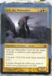
If you’ve been following along since week one you should feel fairly comfortable doing basic alters with your cards. A few weeks ago we covered some of the more advanced theory behind painting, and this week we are going to put it all together on our first mythic alter. I've mentioned many times that there is money to be made in painting commanders, so enter Uril, the Miststalker.
This is a surprisingly tricky project, so feel free to view this as your “Color Theory Boss Battle”. We will be working primarily with a mixture that includes four different colors and using different shades of those colors. Creating these values can be time-consuming, disheartening and very tedious. You might find yourself constantly remixing colors just to touch up an area you thought was done.
This project, especially the beginning, will try your patience like never before. As with any other project though, once you gain an understanding of the particular hue in question, things will become easier.
You can achieve this by experimenting with your paints. The more you experiment, the more you will learn about how your paints work together. If you find yourself becoming increasingly frustrated by this project do not be afraid to walk away for a while. The paint and card will both still be there when you want to start again. That being said, let’s dive in!
 To begin with, take your white and black and mix up a light gray. Add an amount of blue to make a slate(ish) color. This will make a decent undercoat color to lay down on our borders.
From here you’ll want to add crimson to your mixture. You should come up with a sort of grayish purple. You can add blue and black to darken your color, or white and red to lighten it to match the mountains and mists surrounding our hero. As usual, I can't tell you exactly how much of either, as different print runs will produce different colors on the card--this is where the earlier-mentioned experimenting will pay off.
Use this color to match up with the mountains. Be sure that you are matching the mountains and not the mist that surrounds them. While this is drying, it may be a great time to take a break from color matching and just paint the bottom border black.
The fun thing about this card is that everything can be painted using different values of the same color. So as we move on to the sky, you can take your mixture and add varying amounts of white to match the gradient of the mists above and around the name box.
You will also find that some of the same colors can be used to create the mists around Uril’s legs. I’ve found that by using a dry brush, and moving from a darker color to a lighter, a convincing mist can be painted in a matter of minutes.
The tricky part is, once again, matching the original color of the mist. Instead of matching the color exactly, blend the original color with a similar one of your own creation. As long as the two colors are very close in appearance, the general effect of this can be very convincing.
Really? That’s it?
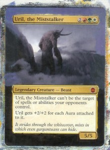
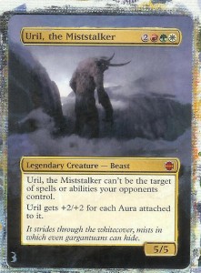
By now your card should look roughly like the second example. From here you have touch-up work left to do. By playing with your color mixture you can always find a better match for the colors. There are always details that can be added or improved as well.
Perhaps you want to add more mist around that peak on the left. Maybe you want to drag the mist further down the text box. Unless you have been commissioned to work on this card, than this is your artwork. Take this opportunity to own it. Until next time!


