Are you a Quiet Speculation member?
If not, now is a perfect time to join up! Our powerful tools, breaking-news analysis, and exclusive Discord channel will make sure you stay up to date and ahead of the curve.


If not, now is a perfect time to join up! Our powerful tools, breaking-news analysis, and exclusive Discord channel will make sure you stay up to date and ahead of the curve.


You must be logged in to post a comment.
Browse thousands of prices with the first and most comprehensive MTG Finance tool around.
Trader Tools lists both buylist and retail prices for every MTG card, going back a decade.

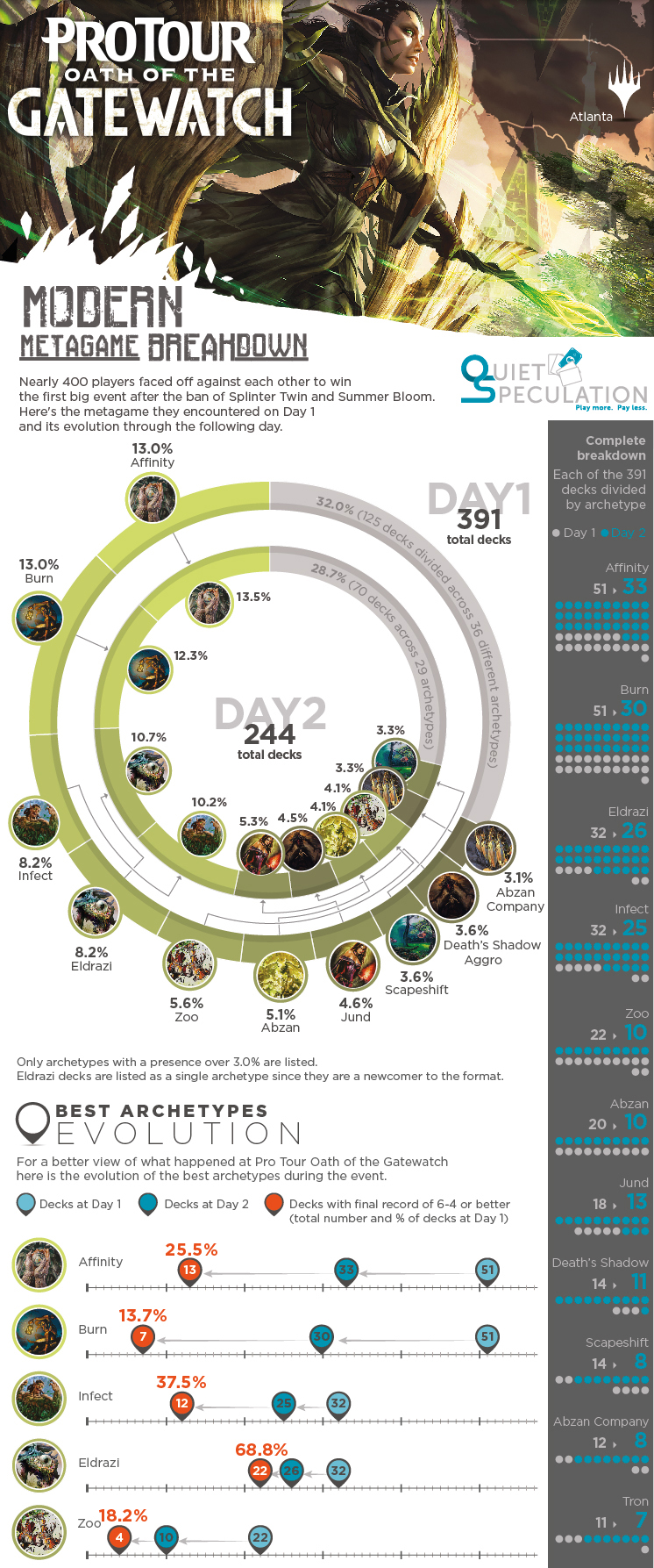
This is a very cool way to visualize the Pro Tour metagame! One small suggestion: the pie chart was very confusing because you ordered it by percent of the field separately for Day 1 and Day 2. It would have been much easier to track each individual deck if you kept them in the same order for both days.
Fantastic looking infographics, really makes the metagame breakdown quick and easy to understand, thanks for this!
As Daniel said though, the Day1/Day2 pie chart was slightly confusing – I understand keeping the decks ordered by field percentage for each day, but it might be worth considering more easily distinguishable colours for each deck to improve clarity?